Beyond Policing disseny de cartell
La meva clienta estava organitzant una taula rodona sobre alternatives a la policia i espais més segurs a la universitat. Com a representant d'Igualtat d'Oportunitats i de les Dones a la Weißensee Academy of Art de Berlín, Alemanya, organitza regularment esdeveniments amb perspectives feministes i interseccionals.
informe del projecte
El públic destinatari era estudiants que volien aprendre sobre el control policial i la vigilància a les universitats, i sobre alternatives a aquests models. Era un moment d'intensificació de la violència policial i de protestes estudiantils, i volíem destacar possibilitats optimistes al pòster, en lloc d'utilitzar una imatge potencialment impactant de violència policial al campus.
La sala d'impressió de la universitat ens va recomanar que els enviéssim un fitxer configurat en paper SRA3 i que el retallarien a A3. El meu client va sol·licitar una versió adaptada del gràfic per a les xarxes socials i un PDF més petit per enviar per correu electrònic.
el procés
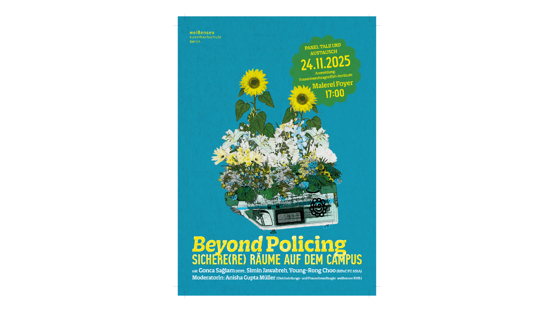
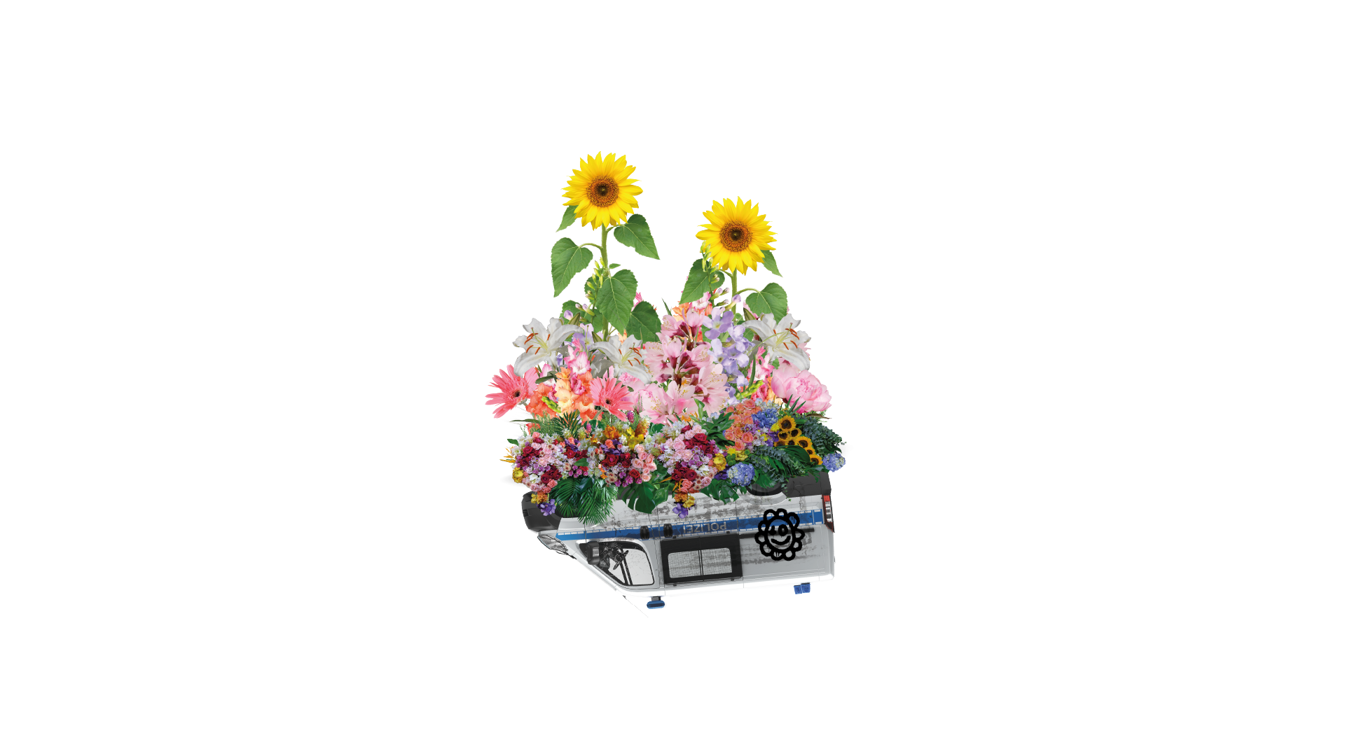
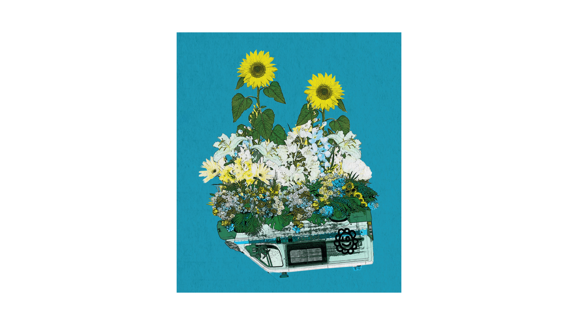
Vaig fer una pluja d'idees i alguns esbossos pensant en representacions visuals de justícia transformadora i espais més segurs. Vaig tenir la visió d'un antic cotxe de policia rovellat que s'utilitzava com a jardiner. Així que vaig fer un collage d'una furgoneta de policia una mica trencada i plena de grafitis, amb una abundant collita de flors que en brotaven. Sincerament, va ser molt divertit crear aquesta il·lustració.
Vam decidir adoptar una estètica de fanzine/risogràfica, així que vaig reduir els colors de la il·lustració a groc, cian i negre i la vaig desgastar per donar-li un aire de fotocòpia low-fi. També es va afegir una tipografia lleugerament desgastada (però encara llegible) per fer-hi joc.
Com que era principalment en alemany, hi havia paraules llargues que calia encabir al pòster. Tot i que hi havia una quantitat considerable de text que s'havia d'incloure, volia crear una sensació d'amplitud en el disseny. Això es va aconseguir incloent-hi una gran il·lustració central amb molt d'espai en blanc. El lema floral es va repetir en el grafit de la furgoneta i la forma abstracta ressaltava la data, l'hora i la ubicació de l'esdeveniment.
Comentaris del client
Vaig triar treballar amb la Jen perquè m'agrada molt la seva feina i aprecio la seva integritat política. La Jen té l'equilibri perfecte entre ser organitzada i tenir habilitats de comunicació clares, però també és relaxada: veu el conjunt i té les prioritats ben clares! Mai no he hagut de fer seguiment de coses ni explicar-li massa les meves idees a la Jen (si de cas, seria a l'inrevés!), sempre entén immediatament el meu enfocament 'crítica de poder' i ens ho passem bé en el procés.
Ja hem treballat juntes en força projectes, la qual cosa ja diu molt per si mateixa. És un veritable plaer treballar amb algú amb qui puc xerrar mentre mantenim una relació de treball superproductiva i complim tots els terminis.
També vaig sentir sovint que la Jen anava més enllà del seu paper de dissenyadora. Em va ajudar a estructurar i organitzar les diferents etapes dels projectes, i regularment em donava consells útils sobre com navegar per decisions polítiques més complicades en entorns institucionals. En Jen també té coneixements sobre com fer el disseny accessible, tant en paper com en línia, la qual cosa pot implicar eines més complicades. Aquest suport sovint va ser tan valuós com el treball de disseny en si.
A més, m'encanten els dissenys acabats!! Inicialment tenia algunes idees estètiques vagues del que volia, però realment no tenia capacitat per fer molta recerca pel meu compte. Per tant, vaig estar molt agraïda que la Jen desenvolupés un concepte visual i em presentés diferents idees per valorar. M'encanta especialment que aquest treball en concret tingui una estètica de fanzine. Sembla una cosa força inusual en espais universitaris, i va donar als projectes un llenguatge visual que se sentia molt més proper al que jo esperava.
Recomano la Jen al mil per cent.
No només les peces finals sempre són fantàstiques, sinó que tot el procés de treballar plegades és molt fluid. És una combinació força rara trobar algú amb tanta experiència en organització política i pràctica creativa crítica que també sigui capaç de produir un treball visual sòlid amb un termini ajustat i de compaginar tota l'organització que això comporta.
Sempre vaig tenir la sensació que la Jen entenia tant el contingut polític com les realitats pràctiques de tirar les coses endavant, cosa que va fer que la col·laboració fos realment fàcil i agradable.”
— Anisha Gupta Müller, Kunsthochschule Weissensee