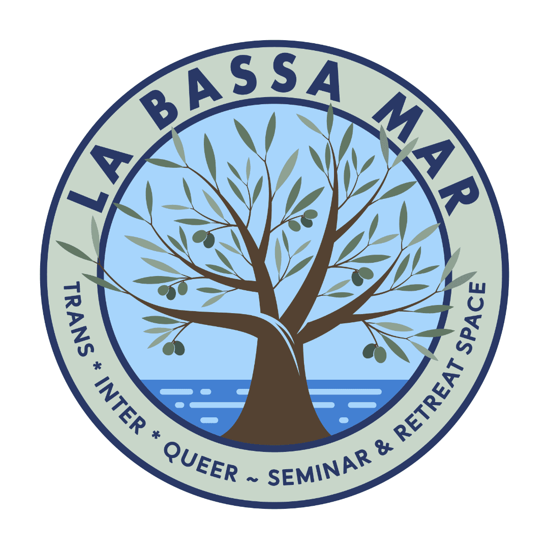
Logo design for La Bassa Mar
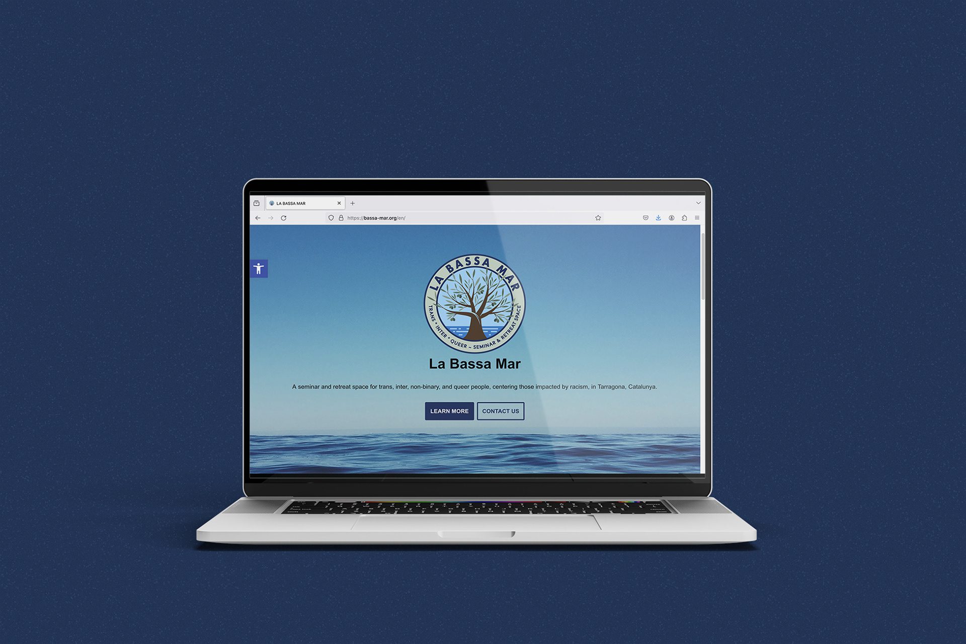
La Bassa Mar is a seminar and retreat space for trans, intersex, non-binary, and queer people, centering those impacted by racism, in Tarragona, Catalunya.
THE BRIEF
The project founders asked me to make them a new, bespoke logo. It should be warm, welcoming, and accessible, conveying the care and serenity embodied by La Bassa Mar retreat and seminar venue.
THE PROCESS
The logo was a joy to create. As we dove into the values and importance of the project, and it’s aims to provide a place of peace and serenity, we explored various symbols and colour palettes.
Eventually we arrived to the final design which expresses the tranquillity to be found at this retreat between the olive groves and the Mediterranean Sea.
CLIENT FEEDBACK
“We are super happy with our new logo! Thanks so much to Jen for the beautiful design.”
— La Bassa Mar