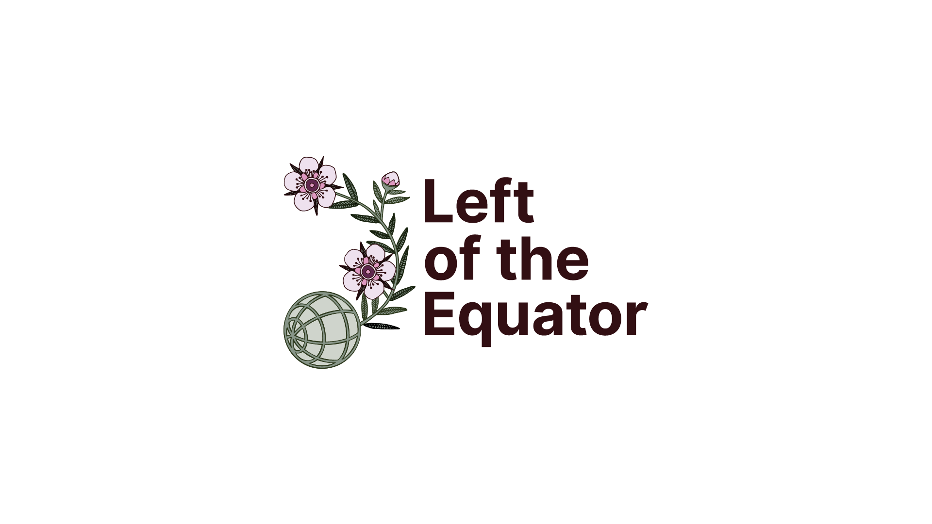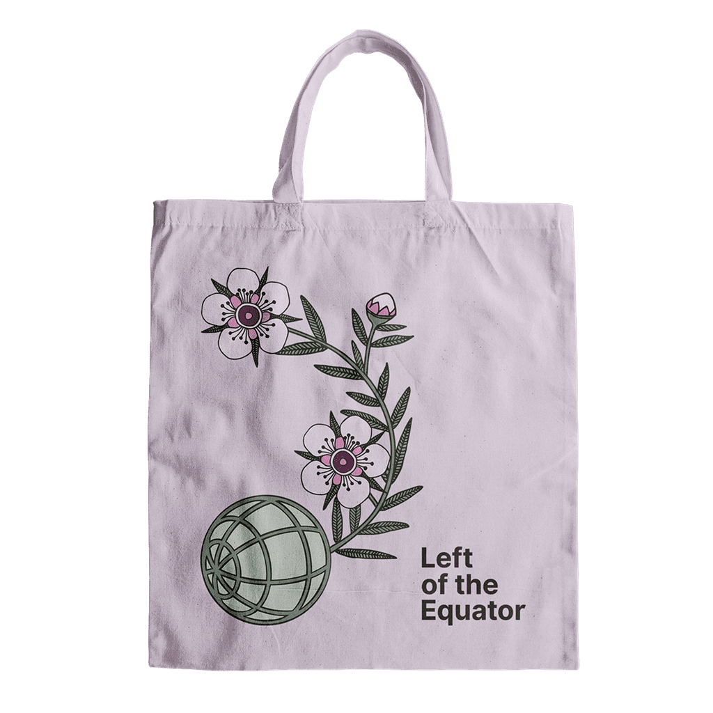
Branding for Left of the Equator Press
Left of the Equator publishes books from Aotearoa for a world beyond capitalism and colonialism. Some of their titles include Kia Mau: Resisting Colonial Fictions by Tina Ngata, The Day the Raids Came: Stories of Survival and Resistance to the State Terror Raids edited by Valerie Morse, and Jewish Not Zionist by Marilyn Garson.
the brief
Left of the Equator was a new publishing project and it needed a logo – to appear on the books, for the website and social media primarily. The people behind Left of the Equator shared ideas with me for symbolism they wanted to include in the branding.
One key concept was “life persisting in the cracks”, symbolised by native plants that are hardy survivors or act as nursery plants. Another concept was the idea of internationalism and solidarity, the common threads of justice and sustainability that tie us all together on planet earth. Overall, the goal was to communicate resilience, hope and emergence.
They wanted a classic, long-lasting logo, that avoided punk rock anarchist clichés, something more old-fashioned and pared back.
the process
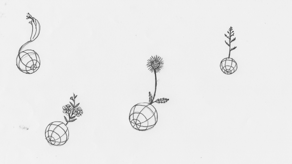
I sketched various ideas combining the globe and different local plants, to create something that resembled a ball of earth with a seedling growing out of it, and/or a cartoonish image of a round bomb with a plant “fuse”. My idea was to subtly reference the “spark” of revolutionary ideas contained in the books, and the concepts of books the as seeds of a new world.
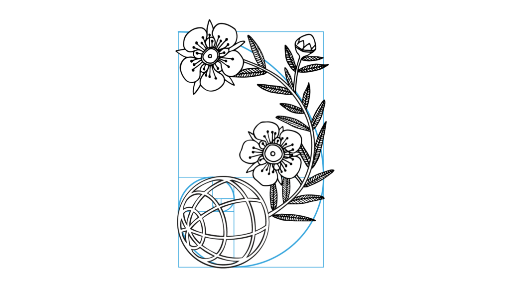
My clients wanted to go ahead with the mānuka plant option, combined with a classic sans serif font. I continued to develop the design, choosing the typeface Inter Bold, and fine-tuning the details and overall shape of the logo. The distinctive flowers were exaggerated in size, to make the specific plant more recognisable.
Mānuka is a prolific and commonly recognised plant in Aotearoa, known for it’s many healing and medicinal properties. Mānuka creates environments where other native species can establish more successfully. Because of this, it’s often utilised by native forest restoration projects in Aotearoa New Zealand.
client feedback
“Thanks Jen for your beautiful logo design. It is so perfect.”
— Left of the Equator Press
the result