Logo design for Gender Minorities Aotearoa
Gender Minorities Aotearoa (GMA) is New Zealand’s leading transgender organisation. It is run by and for transgender people; including binary and non-binary, irawhiti takatāpui, and intersex trans people.
GMA’s vision is for all transgender people, including binary, non-binary, intersex, and irawhiti takatāpui people, to be empowered by a full range of choices across all aspects of their lives, and to be able to participate fully in society.
THE BRIEF
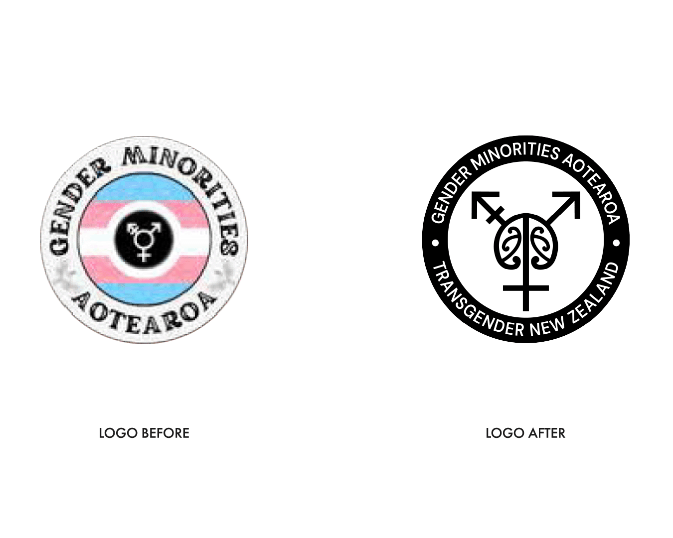
Gender Minorities Aotearoa already had a placeholder logo but they were running into some issues. The existing logo based on the transgender symbol and flag was too detailed, too generic, and was often confused with other transgender organisations. GMA was ready to invest in a unique, custom-made logo that really represented them.
The logo needed to reflect that GMA recognises Māori as first nations, that they serve transgender people who are structurally disadvantaged in additional ways, and that GMA services are available, accessible and of high quality.
As GMA has two key audiences, it was important that the logo spoke to them both: transgender adults, and health sector workers. The design needed to balance friendliness and approachability for the peer support services, with something professional and authoritative for the healthcare sector.
Although it would mostly be used online – for GMA’s website and online trainings, the logo would also be printed on booklets, flyers and other resources. They wanted something unique, simple, clean and classic, that represented their cultural context in Aoteroa.
Gender Minorities already had a strong brand in terms of colour palette – oranges for their peer support work, and blues for their healthcare advocacy, and they wanted to stick with this going forward. They also had existing fonts which they wanted to continue using. So this brief was about creating a logo that fit all the requirements and also worked with the existing colours and typography.
THE PROCESS
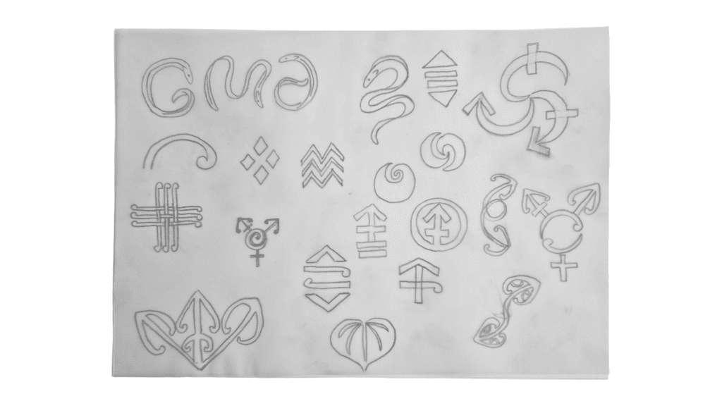
A key consideration was that the logo contain Māori design elements. GMA was already using some patterns and illustrations designed by Māori artists. These were too detailed to form part of the logo, but they provided a useful jumping-off point.
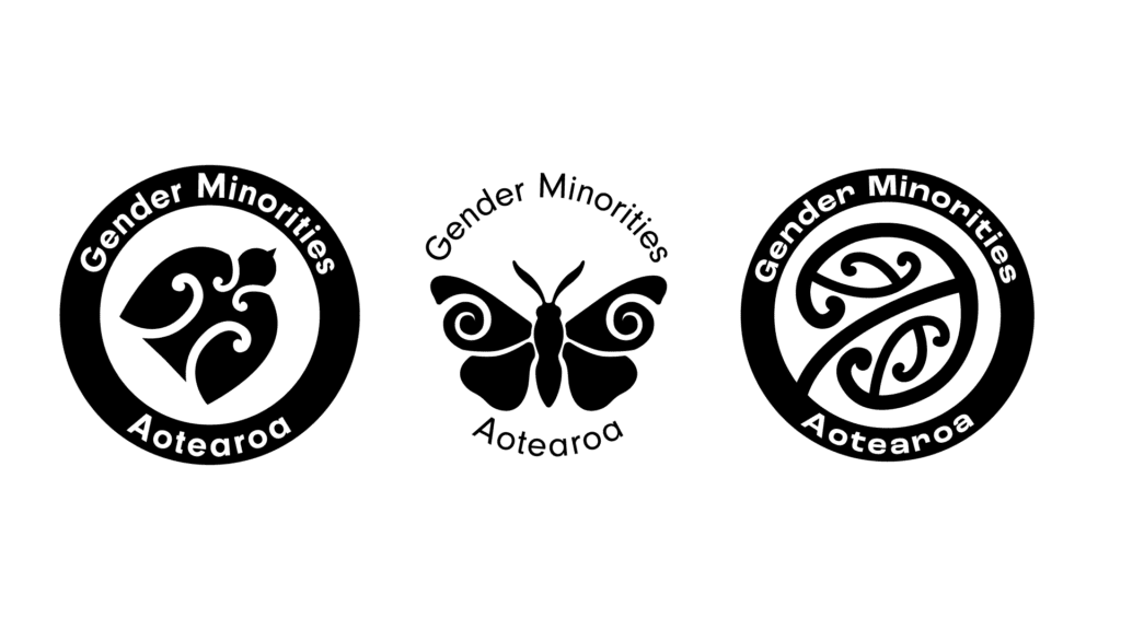
In our initial discussions a lot of different ideas for symbols were shared, from a story about a ‘trans’ korimako, to the pūriri moth, and the leaf of the kawakawa plant. To build on my existing understanding of Māori design traditions, I undertook in-depth research. At this point I also checked in with the client, to confirm that they did not want to work with a Māori designer instead of me (a white New Zealander). They affirmed that they specifically did want to work with me, and we decided to work in a very collaborative way on the design, with leadership from the Māori members of GMA.
We explored a large number of different concept designs, before deciding to move forward with a design that combined Māori imagery with the transgender symbol designed in the 1990s by Holly Boswell, Wendy Parker, and Nancy R. Nangeroni.
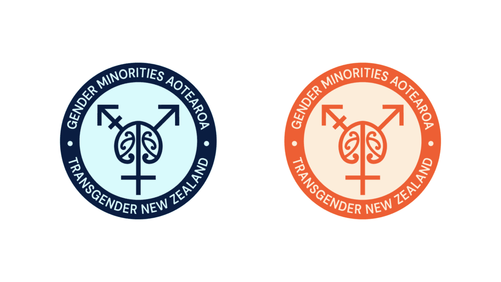
We decided on a mangōpare (hammerhead shark) design, representing courage, strength and power, combined with koiri designs, which represent self-nurturing, flourishing and self-reflection — all of which felt very appropriate for both the work that Gender Minorities Aotearoa does, and the trans people who make use of GMA’s services.
The end result included an orange version of the logo for the peer support services, a blue version for the healthcare sphere, and a black and white watermark version. Multiple layouts were also provided, to ensure flexibility for various use-cases.
CLIENT FEEDBACK
“It’s great! We’re having only joy with it so far!”
— Ahi Wi-Hongi, Executive Director, Gender Minorities Aotearoa
The result